iSchool Web Redesign | 180+ Pages
A summer spent rebuilding 180+ pages of the iSchool website: accessibility, brand-consistent design, clean metadata and a style guide so it stays that way.
Visit live project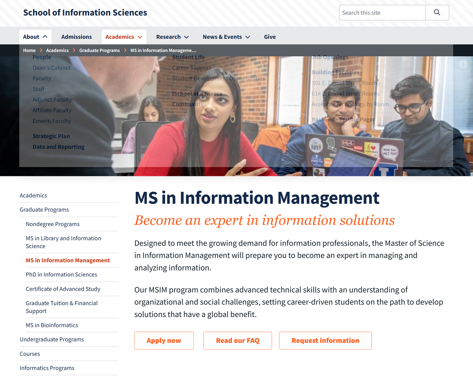
Overview
I spent the summer embedded with the Communications & Marketing team at the University of Illinois School of Information Sciences, working through the website redesign page by page. More than 180 pages passed through my hands inside the school's CMS, academic programs, faculty and staff directories, admissions, research, facilities and news. My job was not just to move content across, but to make each page accessible, on-brand, findable and structured the way a prospective student would actually read it.
The work
The redesign touched almost every corner of the site, so consistency was the real challenge (dozens of contributors had written these pages over many years, in different voices, with different heading habits and wildly different link text. I worked through them in batches by section, rebuilding each page in the CMS against a single agreed pattern: a clear H1, a short orienting summary, scannable subheads, and calls to action in predictable places. The program pages are a good example) every one now opens with the degree name, a one-line promise, two short paragraphs of context, then Apply / FAQ / Request information in the same order, so a student comparing programs never has to relearn the page.
- 180+ pages rebuilt across academics, admissions, people, research, facilities and news
- Consistent page skeleton so users can compare programs without relearning the layout
- Left-hand section navigation and breadcrumbs kept accurate so nobody gets lost mid-site
- Rewrote link and button labels to say where they lead, instead of 'click here' or 'more'
Accessibility
Accessibility was the standing requirement on every page, not a pass at the end. I worked to WCAG 2.1 AA and to the university's Title II / ADA obligations, checking each page as I built it rather than logging issues for later. Most of the recurring problems were structural: headings used for visual size rather than hierarchy, images carrying meaning with no alt text, and PDFs linked without any indication of format.
- Logical heading hierarchy on every page: no skipped levels, one H1
- Descriptive alt text for meaningful images; decorative images marked as such
- Colour contrast checked against AA for text, buttons and link states
- Keyboard-operable navigation with visible focus, including the dropdown menus
- Accessible tables with proper headers, and captioned or transcript-linked media
- Flagged and fixed link text that made no sense out of context for screen reader users
Design and brand
Everything had to sit inside the University of Illinois brand system (the Illini blue and orange palette, the approved typefaces, the photography style) while still reading as the iSchool's own. I worked within the CMS component library rather than fighting it, choosing the right module for each job and keeping spacing, image ratios and button treatments uniform across pages so the site feels like one thing.
- Applied university brand guidelines consistently across every rebuilt page
- Used the CMS component library as intended instead of one-off custom markup
- Standardised hero images, aspect ratios and cropping so pages sit together visually
- Responsive checks on each page across desktop, tablet and mobile breakpoints
Metadata, findability and QA
A lot of the value was invisible: page titles, meta descriptions, URL structure and internal linking. Prospective students arrive from search far more often than from the homepage, so each page needed to stand on its own in a results list. I wrote unique titles and descriptions, tidied URL slugs, fixed broken and redirected links carried over from the old site, and made sure related pages actually pointed at each other.
- Unique, keyword-aware page titles and meta descriptions for each page
- Clean, readable URL slugs and correct breadcrumb placement in the site hierarchy
- Audited and repaired broken and outdated links inherited from the previous site
- Cross-linked related programs, courses and people pages to reduce dead ends
- Proofread and QA'd content against the source material before publishing
The style guide
The part I am proudest of outlasts the redesign. Because many people write for this site, I authored a website style guide documenting the decisions we made, heading structure, alt text expectations, link text rules, tone of voice, image sizing, metadata conventions and CMS component usage. It turned choices that lived in my head into something the next contributor can follow, so the site does not drift back into inconsistency after the project ends.
- Written guidance on accessibility, tone, structure, imagery and metadata
- Worked examples of correct and incorrect patterns, drawn from real pages
- Adopted as the reference for contributors across the Communications team
Related research
More in Websites
LibGuides Accessibility Remediation
Rewriting and remediating engineering research guides so students can actually find (and read) what the library offers.
King's Heritage Foundation Website
I built this site as a volunteer for a children's home in Ijebu Ode. It gave them a public face and helped them win over NGN 800,000 in foundation funding.