Serveased UX/UI Design
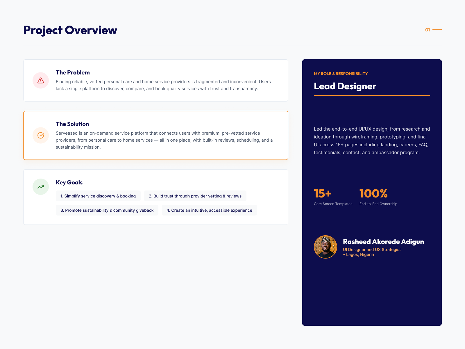
Lead designer on Serveased, the Canadian marketplace and social platform for booking vetted local services, designed end to end from research through a 15+ screen design system.
Visit live project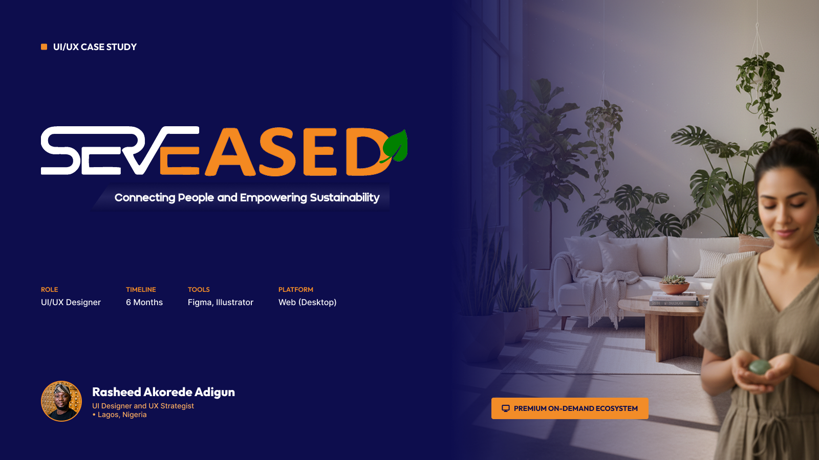
Overview
Serveased is an online platform and technology company based in Ontario, Canada, with roots in Guelph and Toronto, founded in 2020. It is part digital marketplace and part social network: people book multi-category local services, personal care and on-demand help, while socially responsible individuals, small businesses and clients connect around a shared sustainability mission. I joined as the UX strategist and UI designer and owned the experience end to end, user research, personas, information architecture, the design system and the final UI across every core screen.
The problem
Finding a reliable, vetted person to clean your home, care for a relative or fix something is still weirdly hard. The market is fragmented across listings sites, group chats and word of mouth, and none of it gives you one place to discover, compare and book with any real confidence. In our research people described the same loop over and over: find someone, have no way to verify them, book anyway, hope for the best.
- No single place to discover, compare and book quality local services
- Trust was the blocker: people could not tell a vetted provider from an unvetted one
- Booking flows on competing platforms were long enough that people abandoned them
- Eco-conscious customers had no way to filter for providers who shared their values
What I did as UX strategist
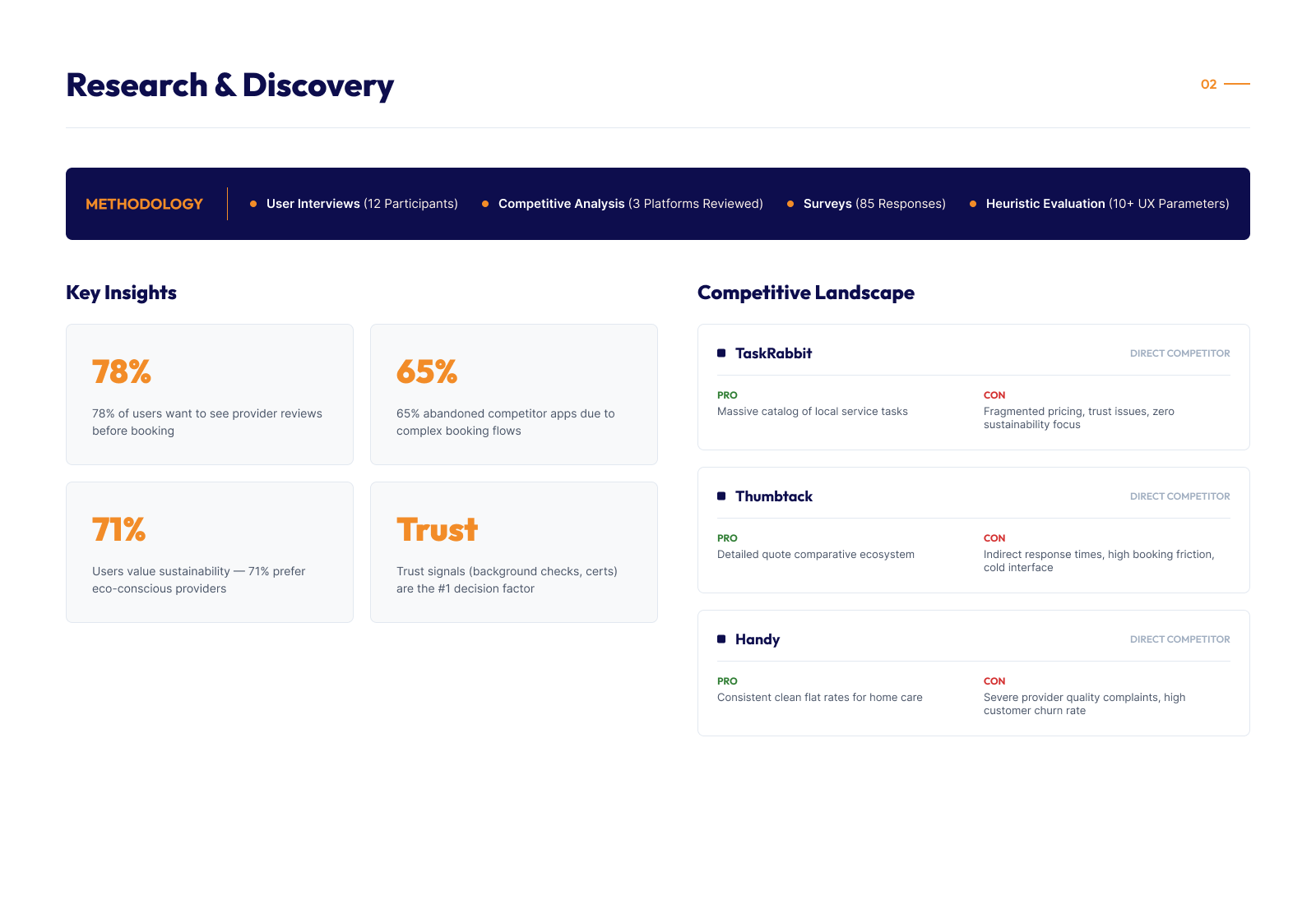
I started with the evidence rather than the interface. I ran 12 user interviews, a 85-response survey, a heuristic evaluation of the existing concept against 10+ UX parameters, and a competitive teardown of TaskRabbit, Thumbtack and Handy. That work set the product direction: trust signals and speed to booking would win, and sustainability was a genuine differentiator rather than a nice-to-have.
- 12 user interviews, 85 survey responses, 3 competitors reviewed in depth
- 78% of users wanted provider reviews before booking; 65% had abandoned a competitor app over a complex booking flow
- 71% preferred eco-conscious providers, so this became the sustainability score feature
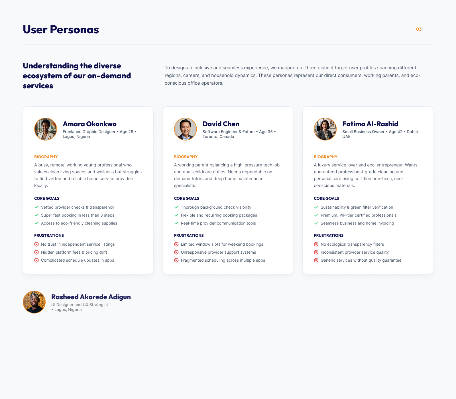
- Built three personas (a freelance designer in Lagos, a working parent in Toronto, a business owner in Dubai) to keep the team arguing about real people, not opinions
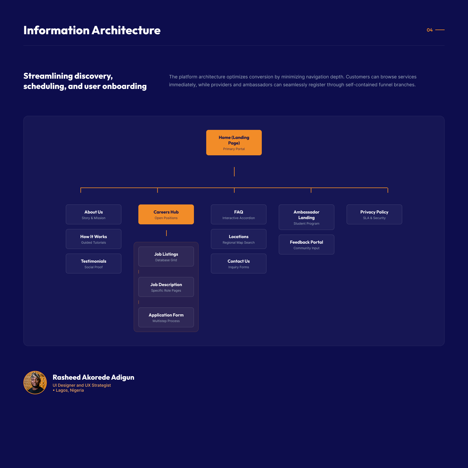
- Defined the information architecture so browsing services takes no navigation depth, while provider and ambassador sign-up sit in their own self-contained funnels
What I did as UI designer
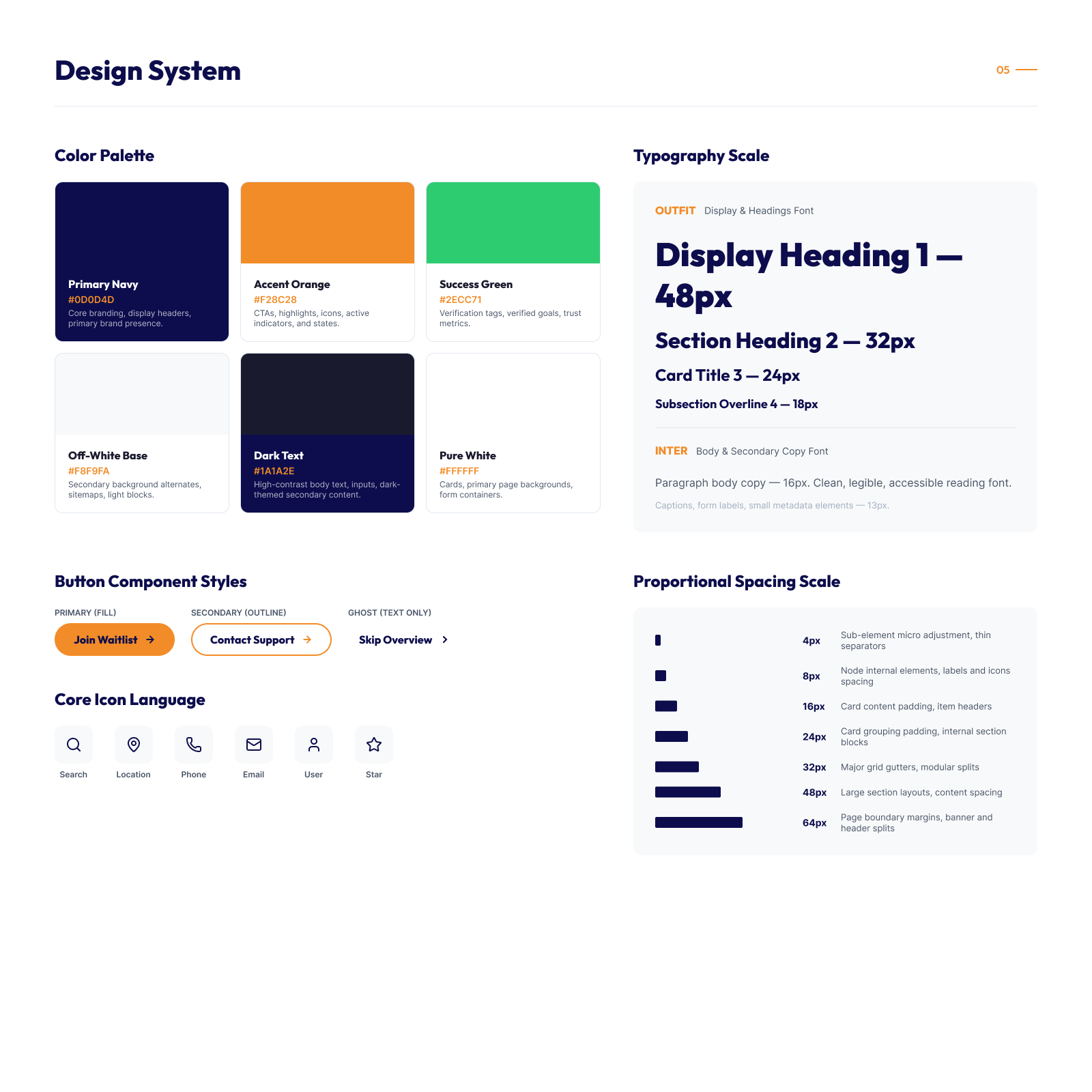
I designed the full interface in Figma and built a design system underneath it so the product stayed coherent as it grew past a handful of screens. The palette leans on a deep navy for brand presence with an orange accent reserved strictly for actions, plus a green used only for verification and trust states, so a green badge always means something has been checked. Outfit carries the headings, Inter the body copy, on a 4/8/16/24/32/48/64px spacing scale.
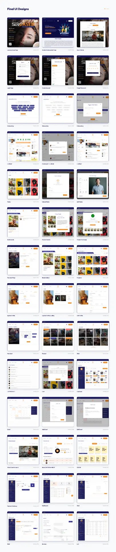
- 15+ core screen templates designed end to end: landing, onboarding, sign-in and account creation, live feed, media, product and merchant pages, cart and checkout, events, chat, invoices and dashboard
- Documented design system covering colour roles, type scale, button variants, icon language and spacing
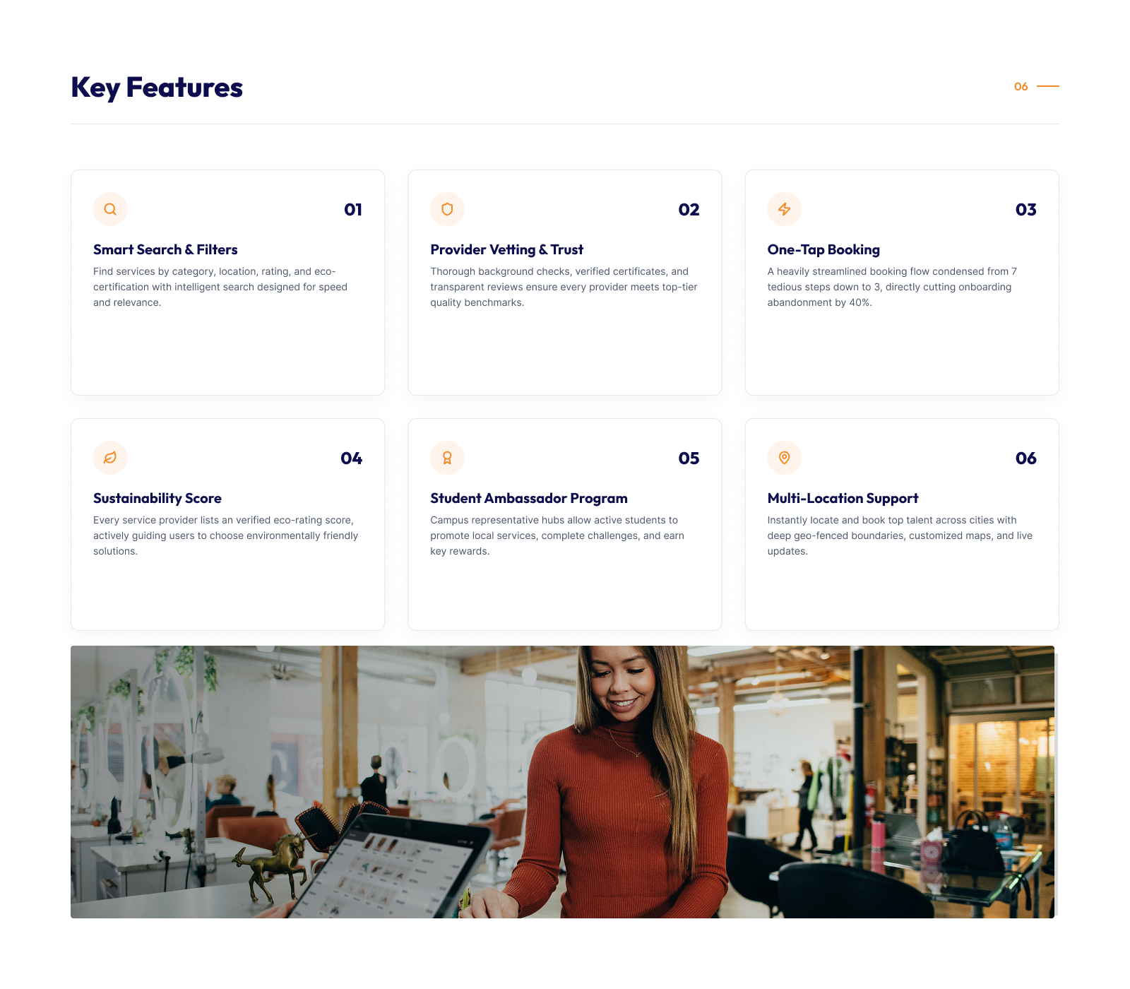
- Booking flow condensed from 7 steps to 3, the single biggest usability change in the project
- Trust surfaced directly in the UI: background-check badges, certifications and transparent reviews on every provider card
- Sustainability score built into search and filtering rather than buried in a profile
- Careers hub, FAQ, ambassador programme and feedback portal designed as part of the same system
Results and what I learned
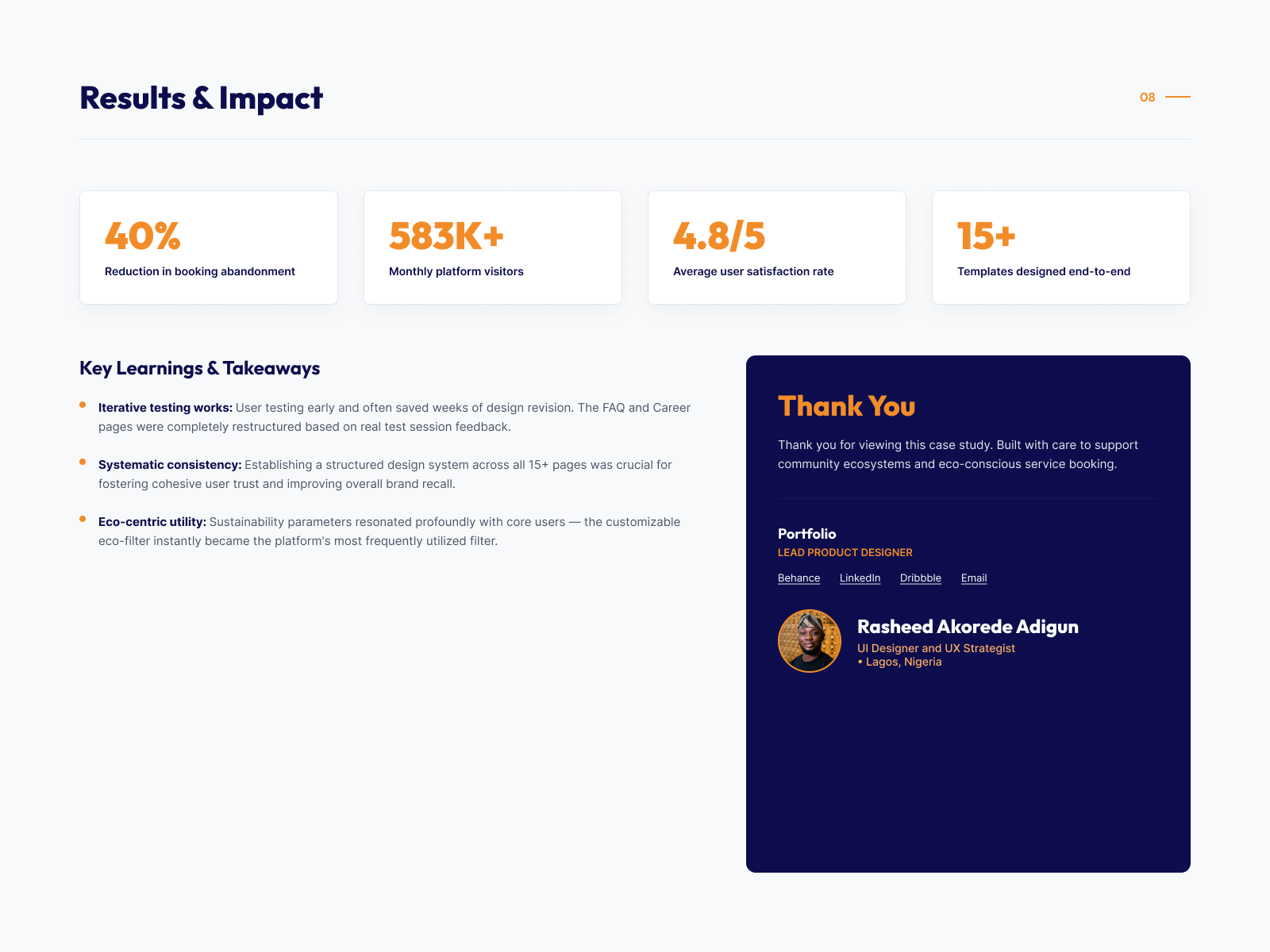
The redesigned booking flow cut abandonment by 40%, the platform reached 583K+ monthly visitors, and user satisfaction settled at 4.8/5. The lesson that stuck: testing early and often is cheaper than being right later, the FAQ and careers pages were restructured completely off the back of real test sessions, and the eco-filter I nearly cut for scope reasons ended up being the most-used filter on the platform.
- 40% reduction in booking abandonment
- 583K+ monthly platform visitors
- 4.8/5 average user satisfaction
- 15+ templates designed end to end, with full ownership of the design work
Case study